
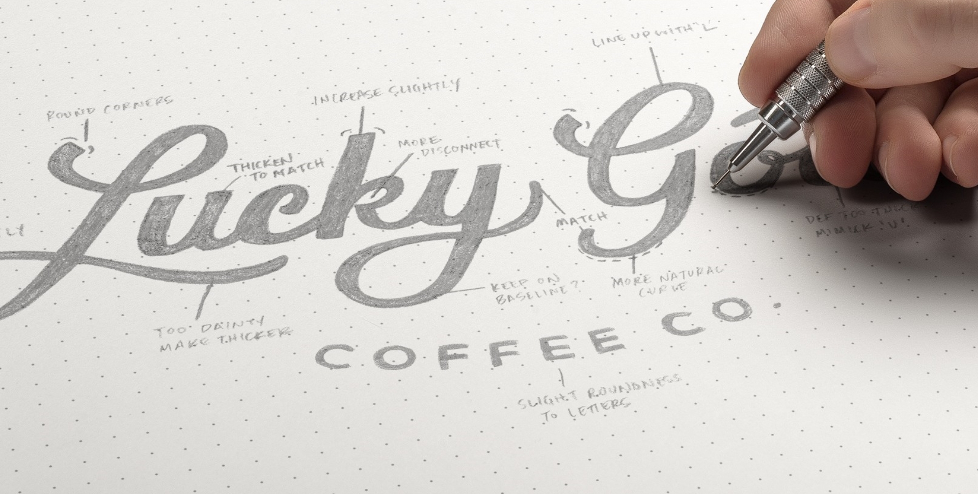
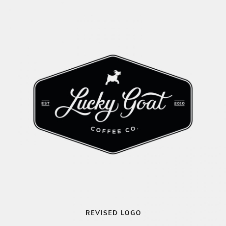
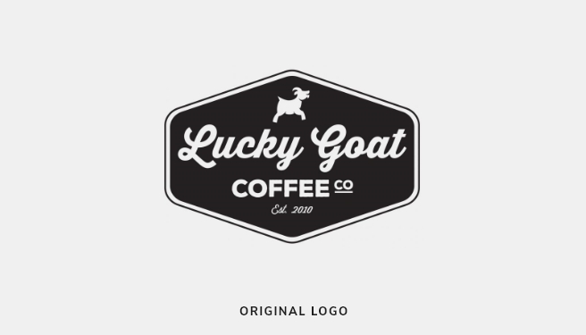
When Taproot and Lucky Goat first began working together, the coffee company had a logo that was recognizable and visually appealing. It was,
Using the existing design as a point of reference, we constructed a custom, hand-lettered logotype that pays homage to the company’s origins while being wholly unique unto itself. The slight hint of similarity between the
however, flawed, having been developed using a readily available font that was easily confused with hundreds of other brands that happen to use the same typeface, many of which are also based in the food and beverage industry.
original design and the new logo also enabled Lucky Goat to seamlessly transition from its past into its current incarnation without confusing or unsettling die-hard customers.
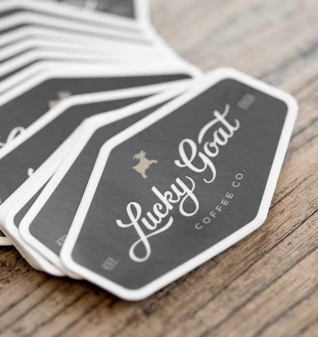

Just about everybody does cold brew these days, but Lucky Goat Coffee was at the forefront of the trend. More importantly, Lucky Goat has always, and continues to, make it better than anyone.
The fine-tasting beverage deserved a finely tailored logo that matches the quality and the tone of the parent mark. We hand-crafted the letterforms to feel right at home with the primary logo, creating a cohesive brand family.